
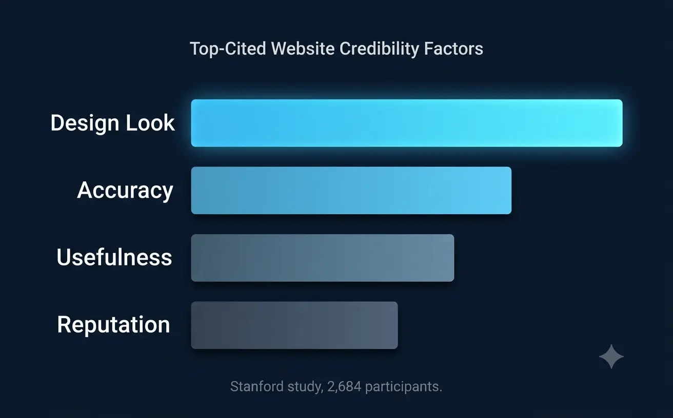
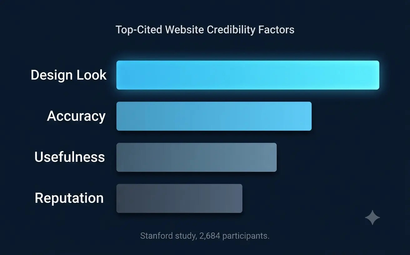
People decide whether to trust you by looking, long before they read a single word. That's not a design-team talking point I'm dressing up for effect. Stanford ran a credibility study with 2,684 participants reviewing live websites, and "design look" came out as the single most-cited credibility factor. Ahead of accuracy. Ahead of usefulness. Ahead of reputation. All of it, combined.
Which is a genuinely uncomfortable finding if your B2B tech brand has spent the last two years obsessing over messaging and basically nothing on how the page actually looks when someone lands on it.
The Blue Problem, and Why It's Gotten Worse
Over 70% of SaaS brands still use blue as their primary color. For twenty years, that made sense: blue signaled trust and stability at a moment when the internet still felt new and a little unproven. That era's over. When every competitor in your category is wearing the same shade of blue, the color stops signaling anything at all. It becomes wallpaper. Buyers scroll past without registering it, because their brains have quietly stopped bothering to notice.
Here's the part that should actually worry you, though, more than the sameness itself. 90% of consumers form a snap judgment about a product based on color alone. If your color palette is indistinguishable from your three closest competitors, you're not just failing to stand out. You're actively losing the one judgment call that happens before a visitor reads a single sentence of your meticulously written value proposition.
Typography Just Became the Real Trust Signal
Something's shifting here, and it's worth paying attention to. Typography is becoming the primary anchor of brand credibility in a period shaped by real economic caution and rising skepticism; people question what's real, what's established, what's actually credible, and design has started responding to that mood directly. Structured type systems read as intentional. Strong hierarchy signals clarity. And thin, ultra-minimal sans-serif systems, the ones that looked sleek in 2019? They're starting to read as fragile. Generic, even. Uncertain, oddly, which is the exact opposite of what a B2B buyer needs to feel about the vendor they're about to bet a year of budget on.
Serif fonts specifically are gaining ground for exactly this reason: they feel rooted, established, considered. Not decorative. Authority is really what it comes down to. A financial services company leaning into structured typographic systems is making a different credibility claim than a lifestyle brand chasing expressive color and hand-drawn texture, and that difference should be a deliberate choice your brand makes on purpose, not something that happened by accident because someone picked a font off a template three years ago and nobody's revisited it since.
Where Most B2B Tech Companies Actually Get This Wrong
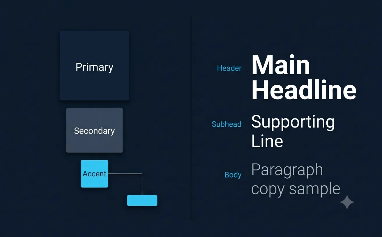
Treating color as decoration instead of positioning. A palette isn't three colors you happen to like. It's a working system where each color has a defined job: primary for identity, secondary for support, one accent color, used consistently, for every single call to action across the entire site. The moment that accent color starts competing with another equally bold color on the same page, the visitor's eye no longer knows where to look. And an eye that doesn't know where to look doesn't click.
Ignoring what "design look" actually communicates about organizational maturity. Buyers aren't purely rational here, whatever they'd tell you in a debrief call. Choosing a vendor that looks credible and established is partly an emotional judgment about professional risk, since the person recommending you internally is managing their own career exposure alongside the actual business decision. Visual polish reads as a proxy for operational competence, whether or not that's technically fair.
Letting the marketing site and the actual product drift apart visually. A brand-product alignment gap is one of the most common, and most quietly damaging, mistakes in B2B tech. Color system consistency between the marketing site and the actual product UI. Typographic hierarchy that holds steady across both. Voice and tone that doesn't suddenly shift once someone's inside the app, in the error messages, the empty states, the onboarding flow. When these drift apart, and they drift more often than you'd think, buyers feel the seam, even when they can't quite name what felt off.
Chasing whatever the current trend happens to be instead of building continuity. Rebranding because something feels dated, rather than because the business itself has genuinely changed, is one of the fastest ways to torch the recognition you spent years building. Familiarity builds confidence. Constant change erodes it, every single time. Strong brands evolve quietly, deliberately, not because a design trend cycled through and everyone else jumped on it first.
What Actually Works, Based on the Research
Accessibility first, always, not as an afterthought bolted on at the end. WCAG recommends a minimum 4.5:1 contrast ratio for normal text, 3:1 for large text. This isn't a compliance checkbox to satisfy legal. It directly supports how credible your site reads, since Google increasingly rewards genuinely usable, inclusive design as part of its broader quality signals, and a visitor who has to squint doesn't stick around long enough to be persuaded by anything else on the page.
One accent color, applied consistently, everywhere a CTA appears across the entire site. Consistency here is what actually creates the predictable visual pattern users learn, without thinking about it, to trust.
A typographic system with genuine hierarchy, not just three font sizes stacked on top of each other and called a system. Headers that establish authority. Body copy built purely for readability. A clear, deliberate distinction between the two, held consistently across every single page.
And white space, treated as a strategic decision rather than space you forgot to fill. Minimalist layouts and generous spacing signal confidence, oddly enough. Brands that don't need to shout are, on some level, perceived as more trustworthy than the ones filling every available pixel because silence made someone nervous.
Two Ways to See This
Infographic 1 should map the credibility hierarchy from that Stanford study, showing "design look" outranking accuracy, usefulness, and reputation as the top-cited trust factor, so the argument lands visually as well as in text.
Infographic 2 should lay out the accent-color and typographic-hierarchy system side by side: one clear color role diagram (primary, secondary, single accent) next to a simple type hierarchy example (header, subhead, body), showing what a working system actually looks like versus an undefined one.
Frequently Asked Questions
Why does visual design matter more for B2B credibility than most tech companies assume?
A Stanford study of 2,684 participants found that "design look" was the most-cited factor in whether people trusted a website, ahead of accuracy, usefulness, and reputation combined. Buyers form a trust judgment before they read any copy, which means visual credibility isn't a supporting detail sitting behind the messaging. It's very often the first, and sometimes the deciding, factor.
Should B2B tech companies stop using blue since so many competitors already do?
Not automatically, but the reasoning behind the choice matters. If blue was picked because "every boardroom before this one asked for something modern and trustworthy," that's inherited furniture, not a real decision. Over 70% of SaaS brands already use blue as a primary color, which means it no longer differentiates the way it did twenty years ago. The question worth asking isn't "should we avoid blue," it's "did we choose this color deliberately, or did we just inherit it?"
Why is typography becoming more important for B2B trust in 2026 specifically?
Economic caution and rising skepticism have shifted what reads as credible. Structured typographic systems and serif fonts are gaining ground because they signal intentionality and authority, while ultra-minimal sans-serif systems that looked sleek a few years ago increasingly read as generic or fragile. The prediction worth taking seriously: distinctive type systems will separate credible brands from the ones still running default web fonts.
What is a brand-product alignment gap and why does it hurt credibility?
It's the gap between how a company's marketing site looks and how its actual product looks and feels once someone's inside it: different color systems, inconsistent typographic hierarchy, a voice that shifts once someone hits the onboarding flow or an error message. Buyers feel this disconnect even when they can't name it precisely, and it quietly undermines the trust the marketing site worked to build in the first place.
What's the single highest-leverage visual change a B2B tech company can make right now?
Auditing accent color consistency across every call-to-action on the site. A single, consistently applied accent color creates the predictable visual pattern that builds trust without a visitor consciously noticing why. Competing bold colors on the same page do the opposite: they force the eye to work harder to figure out where to look, and that friction quietly costs conversions.
References
Fello Agency, Visual Identity Tech: A 2026 Guide for AI and Deep Tech Brands, Stanford credibility study and brand-product alignment analysis: https://www.fello.agency/blog/visual-identity-tech-a-2026-guide-for-ai-deep-tech-brands Tentackles, 4 B2B SaaS Color Palettes That Stand Out in 2026, blue saturation data and color-as-positioning framework: https://tentackles.com/blog/b2b-saas-color-palettes-2026-that-stand-out Hemisphere, Graphic Design Trends 2026: A Brand Forecast, typography as the primary anchor of brand credibility: https://www.hemispheredm.com/graphic-design-trends-2026 Biznamelab, Tech Brand Color Palette: Beyond Blue, WCAG accessibility standards and accent color consistency guidance: https://biznamelab.com/tech-brand-color-palette/ Squark Design, Visual Branding Trends to Ignore in 2026, brand continuity versus trend-chasing analysis: https://www.squarkdesign.com/visual-branding-trends-to-ignore-in-2026-and-what-to-do-instead/


