
There is a specific kind of infographic success that is actually a slow failure, and I know it well because I have produced it. The graphic goes out, gets 200 likes on LinkedIn, the design team is thrilled, the marketing lead puts it in the quarterly win report, and then it never does anything else. It does not earn backlinks. It does not get cited by AI platforms. It sits on the company blog as an image file that crawlers cannot read, doing exactly nothing for the next twelve months.
The problem is rarely the design. The design disciplines for "get shared on LinkedIn" and "get cited by AI" are completely different, and most teams are only playing the first game.
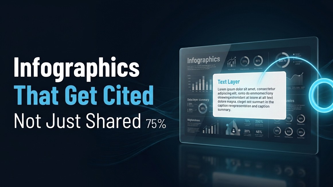
What Is an AEO-Optimized Infographic?
An AEO-optimized infographic is a visual asset built with two simultaneous audiences in mind: the human scrolling LinkedIn who needs to understand a complex idea quickly, and the AI model scanning a web page that needs to extract a specific, attributable data point to use in a synthesized answer. The visual serves the human. The text elements, alt text, structured caption, and surrounding page content serve the AI model.
Most infographics are built only for the first audience. They are beautiful and effective at a glance. They are also, from an AI extraction standpoint, close to invisible, because 69% of AI crawlers cannot execute JavaScript and cannot read text embedded inside an image file. If your infographic's data lives inside a JPG, an AI model sees a blank space where your best data used to be.
The Fundamental Design Problem
The instinct of almost every design team when building an infographic is to make the data part of the visual. The number goes inside the circle. The statistic becomes the headline of a bar chart. The framework gets illustrated with arrows and icons. This is the right instinct for human consumption. It is the wrong architecture for AI citation.
Because here is the thing: AI models do not read images. They read text. And they read the text that surrounds images. An infographic that puts all of its data inside the image file and nothing in the surrounding page copy has essentially hidden its most valuable content from the platforms most likely to cite it.
The fix is not to make infographics less visual. It is to build the text layer that runs alongside the visual. The data that lives inside the graphic also needs to live in accessible text, in the alt text, in the caption, in the body copy on the same page, in a structured list below the graphic. Not a word-for-word transcription. A complementary text representation that gives AI models something to extract.
The Four-Element Structure That Works
Here is what an infographic page built for both human and AI audiences looks like.
- The visual itself, built for human comprehension. Clear hierarchy, minimal text inside the image, strong data visualization, the brand design language applied consistently. This part has not changed. Design for the human who needs to understand something at a glance and might share it.
- A descriptive alt text that names the key insight. Not "infographic about marketing statistics." Something like "B2B content repurposing framework showing that one 2,000-word blog post produces an average of seven LinkedIn posts, three email segments, and two downloadable assets based on Nagana Media's production data." Alt text is read by AI crawlers and screen readers. It is your one-line citation anchor. Make it count.
- A short structured caption or summary below the graphic. Three to five sentences that pull the two or three most important data points out of the visual and put them in plain text. "Companies that repurpose content consistently see 30% higher organic traffic than those publishing only original pieces. The most underutilized repurposing format is email, with fewer than 40% of content teams adapting blog content for their newsletter audience." This is the text an AI model reads when the image file is inaccessible. This is what gets extracted and cited.
- A source and date line. "Data: Nagana Media internal analysis, Q1 2026" or "Source: CMI 2025 B2B Content Marketing Report." Attribution both builds credibility for the human reader and provides the source label an AI model uses when deciding whether to cite this page. Unsourced data earns less citation trust than sourced data, all else being equal.
The Distribution Habit That Changes the Game
Most infographics are published as a LinkedIn image post and a blog embed. That is fine as far as it goes, but it leaves the page-level SEO and GEO work undone.
The infographic page on your website needs a proper URL, a descriptive H1 heading, a keyword-rich introduction paragraph, the structured caption and source line described above, and internal links to related content on the site. When all of that exists, the page is not just an image host. It is a citable GEO asset that AI models can find, read, and attribute to your brand.
This is the same discipline that makes comparison tables citable rather than decorative. The table needs its own structured page with descriptive column headers and sourced data, not just a screenshot in a blog post. The infographic needs its own structured page with alt text and a text summary, not just a LinkedIn image upload. The visual earns the share. The page earns the citation.
The One That Earns Citations for a Year
The highest-performing infographics for AI citation purposes are the ones that answer a specific buyer question with a named framework or a specific data set that does not exist anywhere else.
A benchmark graphic, average contract review time across legal team sizes, for instance, based on your own customer data, is something AI models have to cite from you because the data exists only from you. A process diagram translating your own implementation methodology into a visual sequence is something AI models cite when buyers ask about how implementation works. These graphics are not viral. They do not get two hundred LinkedIn likes. They get twenty-five bookmarks from practitioners who actually use them, and they earn AI citations for twelve months because the underlying data has nowhere else to come from.
The "will this go viral" question and the "will this get cited by AI for a year" question have different answers almost every time. Knowing which one you are building for changes every design decision that follows.
Frequently Asked Questions
Why do most B2B infographics fail to get cited by AI search platforms?
Most infographics embed all of their data inside the image file itself, which AI crawlers cannot read. 69% of AI crawlers cannot execute JavaScript and cannot extract text from JPG or PNG files. An infographic without descriptive alt text, a structured text summary on the same page, and a source attribution line has hidden its most valuable content from the platforms most likely to cite it, regardless of how strong the visual design is.
What alt text format works best for AEO and GEO infographic citation?
Alt text that names the specific insight rather than the content format. "B2B content repurposing framework showing seven LinkedIn posts, three email segments, and two downloadables from one 2,000-word blog, based on Nagana Media production data" is citable. "Infographic about content marketing" is not. The alt text functions as the one-line citation anchor that AI models use to attribute the data to a specific source, so it should name the key claim and the source in the same sentence.
How should the page surrounding an infographic be structured for AI citation?
The page needs a descriptive H1 heading, a short introduction paragraph that contextualizes the data, a structured caption below the graphic that pulls the two or three most important data points into plain text, a source and date attribution line, and internal links to related content. This combination makes the page a citation-eligible GEO asset rather than an image host. The visual element alone, without this surrounding text structure, does not produce AI citations regardless of the graphic's quality.
What types of infographics earn the most AI citations over time?
Benchmark graphics built from original data that does not exist in any other publicly accessible form, and process diagrams illustrating a methodology specific to one company's approach. Both are less likely to go viral than topical trend graphics, but both earn AI citations for substantially longer because AI models must cite the source when they cannot synthesize the same data from elsewhere. Data-driven graphics built on proprietary research consistently outperform trend roundups for citation longevity.
Should infographics be published as LinkedIn posts or on a dedicated web page?
Both, for different purposes. The LinkedIn image post earns shares and human attention. The dedicated web page, with a proper URL, H1 heading, structured caption, alt text, and source attribution, earns AI citations and long-term search visibility. Publishing only as a LinkedIn image means the visual earns one week of social attention and no lasting citation value. The page is the GEO asset. LinkedIn is the distribution channel.
References
Mersel AI, GEO Implementation Guide, on 69% of AI crawlers not executing JavaScript and inability to read image text: https://www.mersel.ai/blog/how-to-block-or-allow-ai-bots-on-your-website
Princeton and IIT Delhi GEO Research, Aggarwal et al. SIGKDD 2024, on statistics in content improving AI citation rates 30-40%: cited via Machine Relations Research 2026
Fountain City Tech, GEO for B2B Practitioner's Guide, on content structure and direct-answer formats: https://fountaincity.tech/resources/blog/geo-for-b2b-companies-practitioner-guide/
Lynkdog, AEO and GEO Industry Report 2026, on original data and proprietary benchmarks as citation drivers: https://lynkdog.com/blog/aeo-geo-industry-report-2026


