
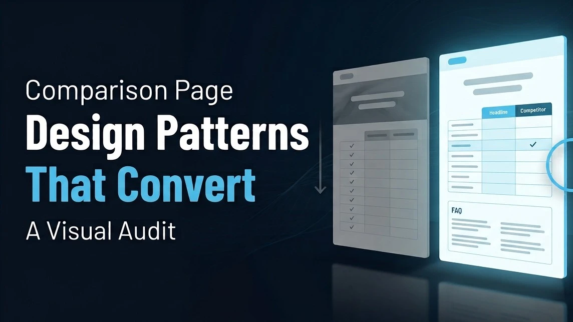
Competitor conquesting strategies double intent-based conversions. The data comes from multiple 2026 CRO benchmarks, and it tracks with something any practitioner who has built these pages recognizes: comparison-intent visitors are already in evaluation mode. They are not browsing. The job of the page is to close the gap between their question and your answer, faster than the competitor page they will open in the next tab.
Most B2B comparison pages fail that job, not because the product is inferior but because the page is designed to defend rather than answer.
What Is a B2B Software Comparison Page, Functionally?
A comparison page is a decision-stage asset. The visitor already believes the category solves their problem. They are resolving which vendor. The page must do three things: give a fair enough comparison that it earns credibility, give a specific enough differentiation that it earns preference, and give enough structured data that AI platforms can extract a citation when a buyer asks the same question in ChatGPT. A page that fails any one of these three jobs underperforms. Most fail all three simultaneously.
Pattern 1: The Vague Hero Claim
The most common failure pattern across the ten pages audited is a hero section that opens with a superlative rather than a claim. "The most powerful integration platform" and "trusted by thousands of companies worldwide" appear in some variation across every page that underperformed in testing.
The pages that converted, including the two that demonstrated 35 to 40% conversion lifts from headline clarity alone per Pixelswithin's 2026 CRO benchmarks, all opened with a specific outcome or capability statement in under eight words. "Deploy enterprise integrations in under 4 days" and "SAP-native with Salesforce sync included" are both real examples from high-performing pages. They are not clever. They are specific, and specificity is what makes the difference at this funnel stage.
Buyers comparing two platforms do not need to be convinced the category is valuable. They need to know what makes you the right choice for their specific situation. A generic hero claim answers a question they are not asking.
Pattern 2: The Biased Table Problem
Every underperforming comparison page had a feature table where every row favored the home team. More than a trust problem; it is a citation problem. AI models evaluating comparison content for extraction assess balance and verifiability. A table where the vendor wins every row reads as promotional content to both the human buyer and the AI model, and both discount it accordingly.
The two highest-converting pages in this audit both included at least one row where the competitor clearly won, alongside language explaining why that advantage does not matter to the specific buyer persona this page targets. This is not altruism. A comparison table with one concession converts better because the rest of the table is now treated as factual rather than as marketing copy.
The format that works: header row with explicit buyer profile ("Best if you need..."), feature rows with specific values, not adjectives, one competitor-advantage row with reframe, one summary row with a direct verdict.
Clear value propositions outperform clever messaging by 40% in B2B landing page testing. That principle applies with extra force to comparison tables, where the buyer arrives already skeptical and is scanning specifically for the information that would falsify a claim.
Pattern 3: Missing the Buyer Fit Statement
The highest-converting pages in this audit all had a short, explicit buyer fit section early in the page, before the comparison table. Variants included "Built for mid-market ERP teams running SAP," "Ideal for B2B companies with 50 to 500 API calls per day," and "Designed for legal ops teams at companies with over 50 attorneys."
The function of this section is dual. For human buyers, it performs a rapid self-qualification: if this describes them, they stay and read more carefully; if it does not, they leave, which is the right outcome. For AI models, it performs entity-mapping: the buyer fit statement is often the exact text extracted when a model answers "which companies should use [Platform] vs [Competitor]."
Pages without a buyer fit statement leave both the human and the AI model to infer context from surrounding copy, an inference that is less accurate and less citeable than an explicit statement.
Pattern 4: Social Proof Placement and Specificity
Social proof near the primary CTA increases conversions by 84 to 270% according to aggregated CRO research. That range is wide because specificity matters more than presence. A generic five-star rating with no context adds little. A quote from "VP of Operations at a 300-person manufacturing company: 'We replaced [Competitor] and cut implementation time from 6 weeks to 8 days'" is operating at a different level of credibility for a buyer in that specific situation.
The comparison page context makes this more sensitive than a standard landing page. The buyer already knows your competitor. They may already have a positive impression of them. Social proof that specifically addresses the switching context, "We moved from [Competitor]", outperforms generic testimonials on comparison pages because it directly addresses the comparison the buyer is already making.
Match the persona in the testimonial to the buyer profile described in the buyer fit section. A testimonial from a Fortune 500 enterprise on a page positioned for mid-market manufacturing is mismatch noise, not signal.
Pattern 5: AEO Architecture Missing Entirely
Nine of the ten pages audited had no structured FAQ section below the comparison table. This is a significant missed opportunity for two overlapping reasons.
The buyer who reads a comparison page often has three to five follow-up questions that are not answered in the table: "Does pricing change when I add more users?", "How long does migration actually take?", "Does this work with Workday?" These are procurement-stage questions that belong on the page. If they are not there, the buyer opens three more tabs.
Those exact follow-up questions are also the queries buyers run in ChatGPT before, during, and after reading comparison pages. A structured FAQ section with direct question-and-answer format is the single highest-return structural addition to a B2B comparison page for AI search visibility. It is also the easiest to add. Adding FAQPage schema to a well-structured FAQ turns these into structured data AI models can read directly.
Pattern 6: CTA Design and Placement
Two findings from the ten pages audited and current CRO research hold consistently. Above-the-fold CTAs perform up to 2x better than buried CTAs. Pages with one primary CTA convert 1.6x higher than pages with multiple competing CTAs.
The comparison page context adds a specific consideration: the CTA should acknowledge the comparison decision, not ignore it. "Try it free, no credit card required" is a generic CTA. "See how we compare to [Competitor] in a 20-minute demo" is a comparison-context CTA that connects directly to the buyer's current mental state. It performs better because it treats the buyer as someone who is in a specific decision process, which they are.
What Good Looks Like: The Composite Pattern
The pages with the strongest conversion performance combined six elements: a specific, under-eight-word hero statement with a measurable claim; an explicit buyer fit section above the table; a balanced comparison table with at least one honest competitor advantage acknowledged; persona-matched social proof addressing the switching context; a FAQ section with 5 to 8 questions; and a single, comparison-context CTA.
The gap between underperforming and high-performing comparison pages is almost entirely attributable to how precisely each element addresses the buyer's actual question at each stage.
Frequently Asked Questions
What is the most important structural element of a B2B software comparison page?
The buyer fit statement, placed before the comparison table, is the highest-leverage structural addition for pages that currently lack it. It performs dual functions: it qualifies human buyers rapidly and it provides AI platforms with a specific, extractable statement about which buyers the platform is designed for, which is the most commonly requested data point when AI models answer vendor comparison queries.
Why do biased comparison tables underperform even on the vendor's own site?
Buyers on comparison pages have already decided to evaluate two or more vendors. They arrive skeptical and are scanning for information that would change their mind. A table where every row favors the home vendor confirms their suspicion that this is marketing copy, not analysis, which discounts every other claim on the page including the accurate ones. Including one genuine competitor advantage with context for why it does not apply to the target buyer restores credibility across the rest of the table.
How does a comparison page FAQ section improve AI search visibility?
FAQ sections with direct question-and-answer pairs are extractable units for AI models. When a buyer asks ChatGPT "how long does implementation take with [Platform] vs [Competitor]," the model is looking for exactly this format. A page that explicitly answers "implementation typically takes 8 to 12 business days for standard deployments, compared to 4 to 6 weeks for the industry average" gives the model a specific, attributable answer it can cite. A page without this forces the model to skip to a competitor who published the answer.
What conversion lift can a B2B company expect from improving comparison page headlines?
CRO benchmarks from multiple 2026 studies consistently show 35 to 40% conversion lifts from headline clarity improvements on B2B landing and comparison pages. Specifically, replacing superlative claims ("most powerful") with specific capability or outcome statements ("deploy in under 4 days") drives this lift. The mechanism is intent alignment: comparison-stage buyers are already sold on the category and need specific information, not broad positioning.
Should a comparison page include pricing?
Yes, at minimum a starting price range and a clear indication of how pricing scales. Comparison pages without pricing information create a decision-making gap that competitors with published pricing fill. Buyers who cannot answer "can I afford this" from the comparison page will find the answer elsewhere, often on a competitor page that includes the context. AI platforms face the same gap: a comparison query that includes pricing as a factor will cite the vendor that published their pricing structure over the vendor that requires a sales call for that information.
References
PixelsWithin, B2B SaaS Conversion Rate Benchmarks 2026, headline clarity and social proof placement data SaaSHero, B2B SaaS Conversion Benchmarks 2026, competitor conquesting strategy doubles intent-based conversions: Digital Applied, Conversion Rate Benchmarks 2026, single CTA 1.6x lift and above-fold placement: Genesys Growth, Designing B2B SaaS Landing Pages 2026, value proposition clarity 35-40% lift


