
There's a specific moment on a B2B SaaS homepage that decides more than most marketing teams realize: the first screenshot the buyer actually sees. Not the testimonial above it. Not the customer logo strip. The screenshot. If it looks like a real product a real team uses every day, the buyer's guard drops slightly. If it looks like a mockup, or worse, a stock photo of a laptop showing a vaguely software-shaped interface, the guard goes back up, and everything else on the page now has to work harder to earn trust back.
Screenshots beat stock photos, consistently, across every category of B2B SaaS marketing content. That is not a design preference. It is a trust mechanism, and the best B2B marketing teams have started treating their actual product interface as a case study in its own right, not just supporting material for one.
What Does It Mean to Treat Dashboard Design as Marketing Content?
Treating dashboard design as marketing content means recognizing that the product's own interface, its visual hierarchy, its data density, its restraint, is doing persuasive work whether or not anyone planned for it to. A buyer looking at a real dashboard screenshot is evaluating two things simultaneously: does this solve my problem, and does this look like software built by people who know what they are doing? The second question is answered entirely by design, before a single feature claim is read.
This reframes product screenshots from a supporting visual, something that fills space next to the real argument, into a primary argument in its own right. The dashboards of products like Stripe, Linear, and Amplitude are frequently cited as design benchmarks specifically because they show users what matters right now without making them dig for it, and that same restraint, deployed on a marketing page, communicates competence faster than almost any written claim could.
Why a Real Screenshot Outperforms a Written Case Study, in Certain Moments
A written case study requires the reader to trust the narrative: the numbers, the quotes, the framing of what actually happened. A real product screenshot requires no such trust. The buyer can look at the actual interface and form their own judgment about whether it is dense or clean, whether the data hierarchy makes sense, whether it looks like something their own team would tolerate using every day. That judgment happens faster than reading a 600-word case study, and for a specific type of decision – evaluating whether a product feels usable – it is more persuasive because it is unmediated.
This does not mean screenshots replace case studies. It means they do a different, faster job earlier in the buyer's evaluation, at the exact moment a buyer is deciding whether to keep reading at all. The products that win this moment show the interface in real context: actual data, actual workflows, actual density, not a sanitized, feature-count-maximizing mockup that no real customer's account would ever look like.
The Three Design Principles That Make a Dashboard Work as Marketing
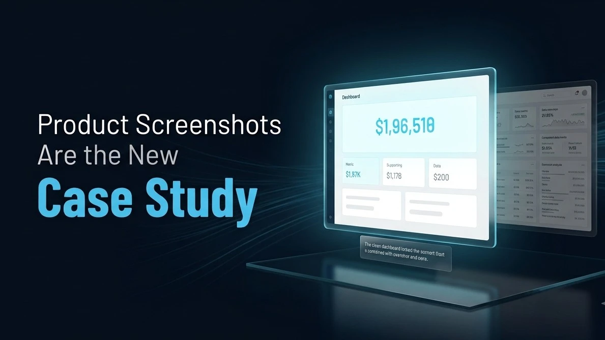
- Restraint over density. The dashboards that function best as marketing content are the ones that resist showing everything the product can do in a single screenshot. A calm, whitespace-heavy view of one clear workflow communicates more confidence than a screenshot crammed with every feature, because it signals that the product knows what matters most to the user in a given moment, rather than treating every feature as equally important. This is the same principle behind the products most frequently cited as best-in-class SaaS interfaces: they earn trust through restraint, not through visual proof of feature breadth.
- A visible, plausible north star metric. A dashboard screenshot used as marketing content works best when it puts a single, clear, believable metric front and center, the number the target buyer actually cares about, rather than a busy grid of every metric the product happens to track. A buyer looking at that screenshot should be able to answer, within about five seconds, what this view is telling them and why it matters. If it takes fifty seconds to parse, the screenshot is working against the marketing goal even if the product itself is excellent.
- Realistic data, not obviously fabricated data. Buyers have become sophisticated enough to recognize a screenshot populated with suspiciously round numbers and generic placeholder names. A dashboard screenshot that shows plausible, specific-feeling data, real-looking company names, real-looking metrics with the kind of variance actual data has, reads as authentic in a way that "Company A: 100 users, Company B: 200 users" never will.
The Format That Is Quietly Becoming Standard: The Screenshot-Led Feature Page
The B2B SaaS websites earning the most trust in 2026 are increasingly building entire feature and solution pages around a real screenshot as the anchor, with supporting copy explaining what the buyer is looking at rather than the reverse. This is a meaningful structural shift from the older pattern of a paragraph of feature copy with a small, decorative screenshot as an afterthought.
The practical implication for a content team: a screenshot-led page requires the design and content functions to collaborate earlier in the process than the traditional workflow allows for. The screenshot cannot be an image dropped in after the copy is finished. It needs to be selected, or specifically prepared, as the central argument the page is making, with the copy built to support and explain it.
Why This Also Matters for AI Search Visibility
Here is the dimension that most teams building screenshot-led pages have not yet connected to their broader content strategy. AI models evaluating a page for citation extract text, not visual information from an embedded image. A stunning, persuasive dashboard screenshot that has no corresponding descriptive text nearby is invisible to an AI model assembling an answer about what your product does or looks like.
The fix mirrors the same pattern that applies to infographics and comparison tables: the screenshot earns the human trust, and a clear, descriptive caption or surrounding paragraph earns the AI citation. A screenshot showing a clean onboarding completion dashboard, paired with a caption stating specifically what the view shows and what outcome it represents, does both jobs at once. The image persuades the human. The text becomes extractable material an AI model can cite when answering a buyer's question about what the product's onboarding experience actually looks like.
What This Changes About How Content and Design Teams Should Work Together
The practical shift this requires is treating the product's own interface as a content asset with the same planning rigor applied to a case study or a blog post. That means identifying, in advance, which specific dashboard views best represent the product's core value for a specific buyer persona, rather than grabbing whatever screenshot happens to be convenient when a marketing page needs an image. It means maintaining a small, curated library of clean, realistic, well-composed product screenshots that the marketing team can pull from consistently. And it means writing the supporting captions and copy with the same answer-first discipline applied to any other AEO-optimized content, so the visual and the text are both doing their respective jobs.
Frequently Asked Questions
Why do B2B SaaS product screenshots outperform stock photography in marketing content?
Product screenshots let a buyer evaluate the actual interface directly, without relying on a written narrative they have to trust. This is a faster, more direct trust signal than a case study for a specific evaluation question: does this look like well-built, usable software. Stock photography or generic mockups create the opposite effect, signaling that the marketing content is disconnected from the actual product, which raises skepticism about every other claim on the page.
What makes a dashboard screenshot effective as a standalone marketing asset?
Three qualities consistently distinguish effective dashboard marketing screenshots: visual restraint that shows one clear workflow rather than every feature simultaneously, a single visible metric that a buyer can identify as important within about five seconds, and realistic, specific-feeling data rather than obviously fabricated placeholder numbers. Screenshots that fail on any of these three dimensions tend to undermine trust rather than build it, regardless of how capable the underlying product actually is.
How should content and design teams collaborate on screenshot-led marketing pages?
Design and content teams need to plan screenshot-led pages together from the start, rather than treating the screenshot as an image added after the copy is finalized. This means identifying in advance which specific product views best represent the core value proposition for a given buyer persona, and writing supporting copy that explains and reinforces what the screenshot shows rather than repeating information the image already communicates.
Are product screenshots invisible to AI search platforms, and how should that be addressed?
Yes, AI models extract and cite text, not visual information embedded in an image file. A persuasive dashboard screenshot with no descriptive text nearby provides no material an AI model can cite when answering a buyer's question about the product. The fix is pairing every marketing screenshot with a clear, specific caption or supporting paragraph describing exactly what the view shows and what outcome it represents, which gives both the human viewer and the AI model something to act on.
Should dashboard screenshots replace written case studies in B2B marketing?
No, they serve different and complementary purposes. Screenshots answer the faster, more visceral question of whether the product looks usable and well-built, which matters most early in a buyer's evaluation. Case studies answer the slower question of whether the product produces a specific, verifiable business outcome for a company like the buyer's own, which matters more later in the evaluation when the buyer is building an internal justification. The strongest B2B marketing pages typically use both, with the screenshot as an early trust signal and the case study as a deeper proof point further down the page or later in the buyer journey.
References
- SaaSUI, 7 SaaS UI Design Trends for 2026, Shown With Real Screens, calm design and restraint principles from Linear and Notion: https://www.saasui.design/blog/7-saas-ui-design-trends-2026
- 925Studios, 35 SaaS Dashboard Design Examples, Trends and Patterns 2026, north star metric and visual hierarchy analysis: https://www.925studios.co/blog/saas-dashboard-design-examples-2026
- Swipe Pages, 12 Best SaaS Landing Page Examples of 2026, screenshots versus stock photo conversion analysis: https://swipepages.com/blog/12-best-saas-landing-page-examples-of-2026/
- Webflow, 35 SaaS Website Design Examples to Learn From in 2026, screenshot-led feature page pattern analysis: https://webflow.com/blog/saas-website-design-examples


