
There's a visual exercise I find genuinely useful when a B2B technology client comes to me with a website problem. I ask them to cover the logo and company name on their homepage screenshot, and then tell me, just from the page design and content, what makes this company different from the three competitors they named in the intake call. Most of the time, they cannot do it. Not because their product is undifferentiated. Because the website is.
What Does "Looking the Same" Actually Cost in 2026?
The marketing cost is well understood: visual interchangeability reduces brand recall, makes it harder for buyers to remember which company said what after a research session, and pushes evaluation decisions toward factors other than brand, usually price. But there is a GEO cost that most B2B technology companies have not yet internalized, and it is happening on top of the marketing cost.
AI tools are summarizing, comparing, and filtering vendors before a human ever visits the site. If your brand is vague or inconsistent, you are easier to ignore. This is why branding is becoming more structured. It needs to hold up across a growing number of pages, campaigns, and channels. It also needs to be clear enough to be interpreted correctly, whether by a person or a machine.
A website that is visually and verbally interchangeable with its competitors does not just fail to impress a human visitor. It fails the entity disambiguation test AI models run when building a vendor comparison or a category shortlist. If your homepage describes you in language that could apply to three competitors without changing a word, an AI model building a shortlist has no clear reason to distinguish you. It either describes all of you in the same words, or it cites the one that gave it the clearest, most specific signal.
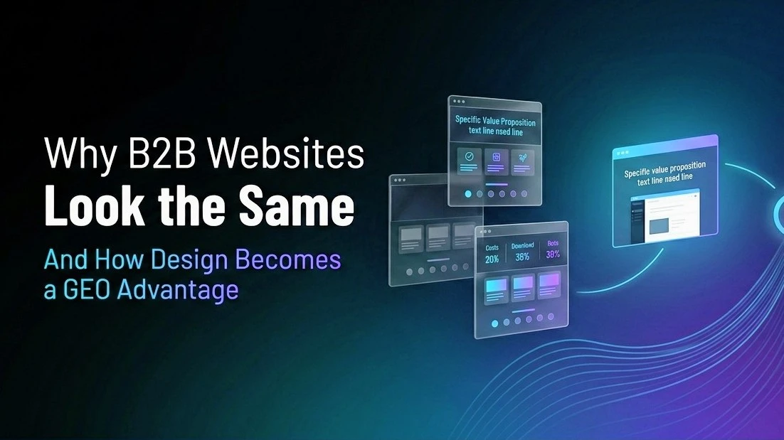
The Template That Has Eaten B2B Web Design
The template is now so consistent I can describe it without visiting any specific website. Dark navy hero section. Large headline promising a transformation in under ten words. Three benefit cards with icons. A row of customer logos. A testimonial. A CTA section.
This template came from analytics of high-converting B2B SaaS websites from 2017 to 2022. It performed well. Then everyone copied it. Then conversion became relative to what else a buyer sees during evaluation, and if every site in a category uses the same template, the template becomes wallpaper.
In 2026, aesthetics are secondary. The defining traits of elite agencies are: Sites must be optimised for Generative Engine Optimisation (GEO), structured schema, semantic clarity, and machine-readable authority. Information density must be high, but delivered through structured hierarchy, whitespace, and progressive disclosure.
The interesting thing about that shift is what it implies for design. GEO-ready design is not maximalist. It is clear, specific, and hierarchically honest. Those are design properties, not just content properties. The layout determines whether a human or an AI model can find the most important information in the first few seconds. A template designed for "safe" B2B web design in 2020 was not built with AI extraction in mind.
What Differentiates a B2B Website in 2026
Three properties are pulling ahead as markers of genuine visual differentiation, and all three happen to also improve AI search visibility. This is not a coincidence.
Specificity in the hero section. The most effective B2B homepage headlines in 2026 describe a specific buyer in a specific situation achieving a specific outcome. "Contract management for mid-market manufacturing teams that use SAP" is twelve words that tell a qualified buyer immediately whether they are in the right place. It is also twelve words an AI model can extract as an entity descriptor and use to match this company to relevant category queries. "We help businesses unlock their potential" tells an AI model exactly nothing about buyer fit, category, or differentiation.
Visual hierarchy that leads with answers, not impressions. The visual hierarchy of most B2B websites prioritizes the feeling of authority: large type, dramatic backgrounds, impressive animations. The visual hierarchy that converts and earns AI citation prioritizes the answer: the buyer's problem named in the first line, the solution described in the second, the proof in the third. Good design can make this hierarchy beautiful and not just functional. The error is treating visual impression as a substitute for the answer rather than as a wrapper for it.
Distinct visual language that builds entity recognition. Consistent branding helps increase recognition and revenue. Studies show that presenting a brand consistently across platforms can boost revenue by up to 23%. Colors alone can improve brand recognition by 80%, making it easier for customers to remember and connect with your business. The same consistency that makes a human remember a brand across touchpoints also helps AI models recognize a brand entity when it appears in different contexts. A company with a distinctive visual language that is consistently applied across its website, its LinkedIn presence, its G2 profile, and its press coverage is easier for both humans and AI systems to recognize as a coherent entity.
The GEO-Specific Design Decisions Worth Making
Several design decisions sit at the intersection of visual differentiation and AI search visibility, and most B2B technology companies have not consciously made them.
Content hierarchy over visual hierarchy. The content that matters most for AI extraction, the company description, the specific buyer fit statement, the key differentiators, should be structurally prominent on the page, not buried three scrolls down because the visual design prioritizes an animation in the hero section. Humans and AI models both reward content that leads with what matters. Design that puts the substantive answer after the impressive impression is optimizing in the wrong order.
Scannable structure with clear H1 and H2 progression. B2B website design trends for 2026 include GEO for AI search visibility. The shift is toward cleaner, faster sites that prioritize buyer clarity, embracing purposeful simplicity over needless visual complexity. Clear structure, specific claims, and well-labelled sections all help content get picked up and cited by AI answer engines. A website with clear, hierarchical heading structure, where each H2 introduces a distinct topic and each H3 refines it, is easier for AI models to parse and extract from than a website where visual design substitutes for semantic structure.
Product UI as the primary visual asset, not brand imagery. The highest-converting B2B homepages in 2026 show the actual product interface above the fold, not a stock photograph or a conceptual illustration. This works because it immediately answers "can this product do what I need" by showing rather than claiming. It also helps AI models understand what category the product belongs to by providing concrete visual evidence of the product's function and interface, which reinforces the entity signals in the surrounding text.
What Deliberately Boring Means and Why It's Wrong
There is an overcorrection worth naming. Teams absorbing the message that B2B websites should be "clear" and "structured" sometimes translate that into designing for blandness. Removing visual personality. Choosing the safest possible palette because "clear" got misread as "visually neutral."
Structure and clarity are not at odds with distinctiveness. They are the frame that makes distinctiveness possible. A company with a specific value proposition, a genuinely distinctive visual language, and a content hierarchy that leads with specific answers is both easier for buyers to choose and easier for AI systems to cite. Those two outcomes come from the same design decisions, not from a trade-off.
Frequently Asked Questions
Why do most B2B technology websites look visually similar in 2026?
Most B2B technology websites converged on the same visual template because that template was derived from the analytics of high-converting B2B SaaS websites from 2017 to 2022. The template itself performed well. But when every competitor in a category adopts the same layout, the same design language, and the same narrative structure, conversion becomes relative to the field rather than absolute, and the template stops being an advantage and becomes visual wallpaper.
How does website visual design affect GEO and AI search visibility?
AI systems building vendor shortlists or category comparisons rely on clear, specific, extractable content signals. A website with vague brand-level claims and undifferentiated visual language provides the same weak signals as its competitors, making it harder for AI models to identify a specific entity and its distinct positioning. Websites with clear heading hierarchies, specific buyer fit statements, and consistent visual identity across touchpoints are easier for AI models to parse, extract from, and cite with confidence.
What is the most important design change a B2B website can make for GEO improvement?
Leading with a specific, outcome-oriented description of buyer fit in the hero section, rather than a broad transformation promise or a category claim, is typically the highest-leverage change. A specific buyer fit statement serves as an entity descriptor that AI models can extract and use to match the company to relevant category queries. It also immediately qualifies or disqualifies human visitors, improving conversion rates among the right buyers.
Does visual distinctiveness conflict with the clarity that AI extraction requires?
No. The conflict between visual distinctiveness and AI-extractable clarity is a false trade-off. Clear content hierarchy and specific, answer-first text structure do not require visual neutrality. They require that design choices support rather than substitute for substantive content. A visually distinctive brand with a specific value proposition, consistent design language, and answer-first content hierarchy is both memorable to human buyers and clear to AI systems. Visual blandness is not a path to AI search visibility.
How does consistent visual branding across platforms improve AI entity recognition?
AI models building entity associations draw from multiple public surfaces, including a company's website, LinkedIn, review profiles, and press coverage. Consistent visual and verbal branding across those surfaces makes it easier for AI systems to recognize multiple appearances of the same entity and build confident, specific associations about what that entity does and who it serves. Inconsistent design across platforms, different color systems, different logo treatments, different visual tones, creates ambiguity that lowers entity recognition confidence the same way inconsistent naming or inconsistent description language does.
References
Bop Design, B2B Branding Trends for 2026 and 2027, AI tools and brand system control: https://www.bopdesign.com/bop-blog/b2b-branding-trends-for-2026-and-2027/
The Business Journal, Best B2B Website Design Agencies 2026, GEO as defining elite agency trait: https://thebusinessjournal.co.uk/b2b-supplier/best-b2b-website-design-agencies/
Musemind, The Best 15 B2B Design Agencies in 2026, brand recognition statistics: https://musemind.agency/blog/top-b2b-design-agencies
Intuitia Tech, B2B Web Design Best Practices That Convert in 2026, GEO and clear structure: https://www.intuitia.tech/blog/b2b-website-design
Clear Digital, 5 B2B Website Design Trends to Watch in 2026, trust-focused design and visual hierarchy: https://www.cleardigital.com/insights/5-b2b-website-design-trends-to-watch


